
Website Design
PRKS
Project Deliverables Logo Design Brand Identity Design Stationery Design Website Design
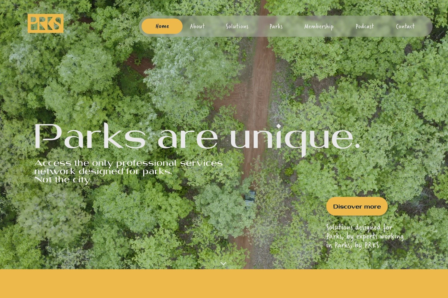

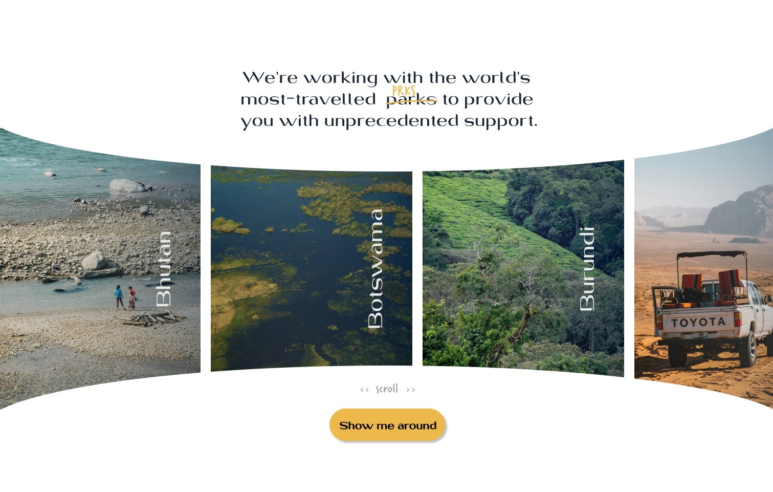
For PRKS, the founder’s goal was clear: to celebrate and reflect the natural beauty of national parks through the brand across the globe - from coast to mountain-top. I worked closely with him to create a logo and brand identity that mirrored the natural landscapes he cherished.
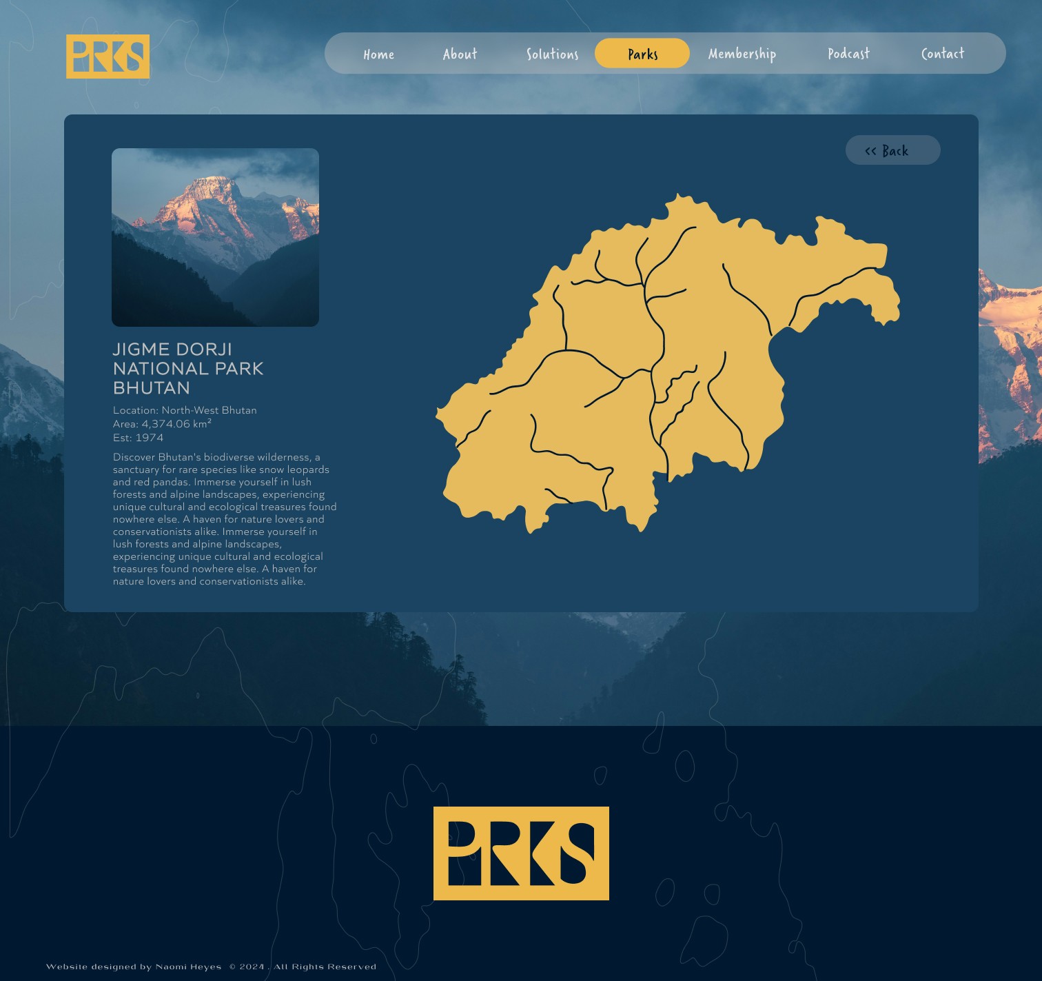
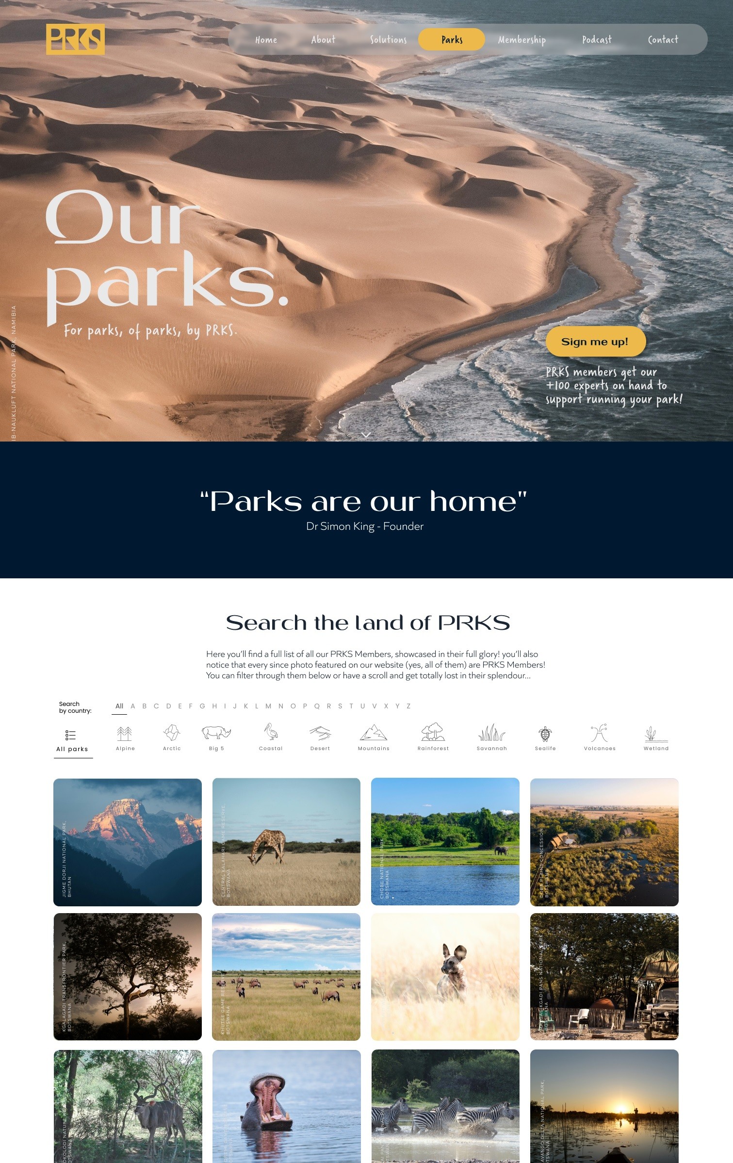
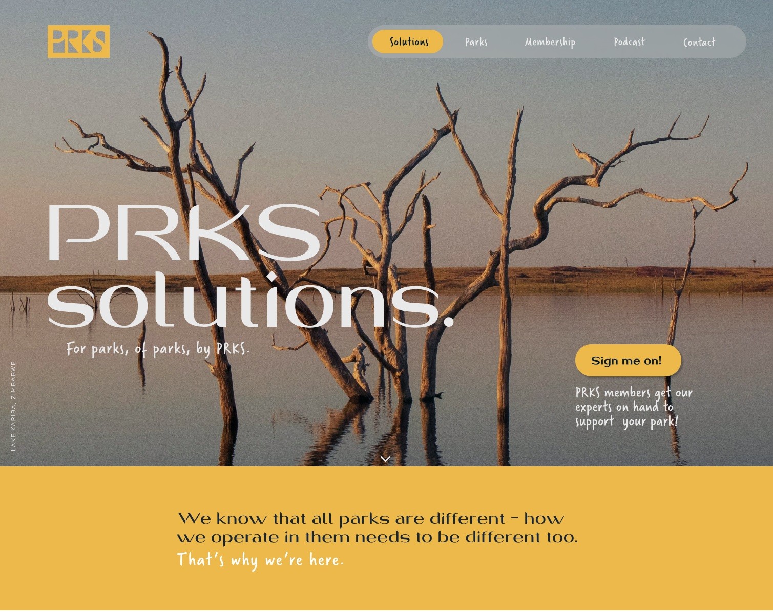
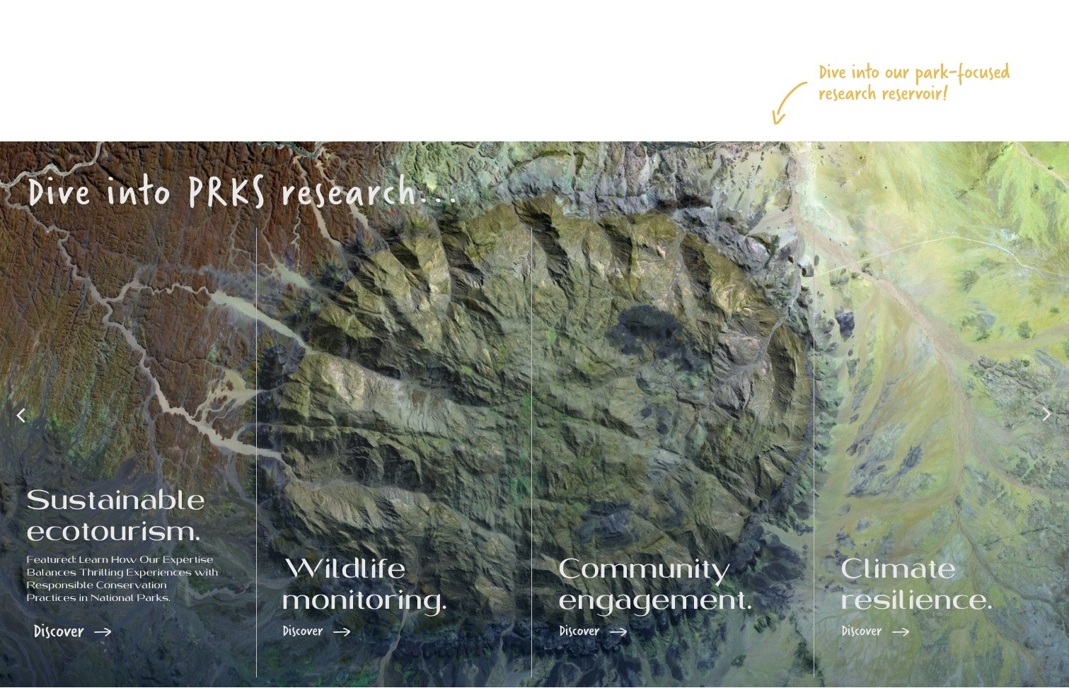
The logo design cleverly mimics the shapes of park themselves, sometimes straight and sometimes curvy - integrating them directly into the letters “PRKS.” To enhance the brand’s connection to nature, I developed a colour palette of natural sandy and clay tones, which became the foundation of the brand’s confident visual identity.
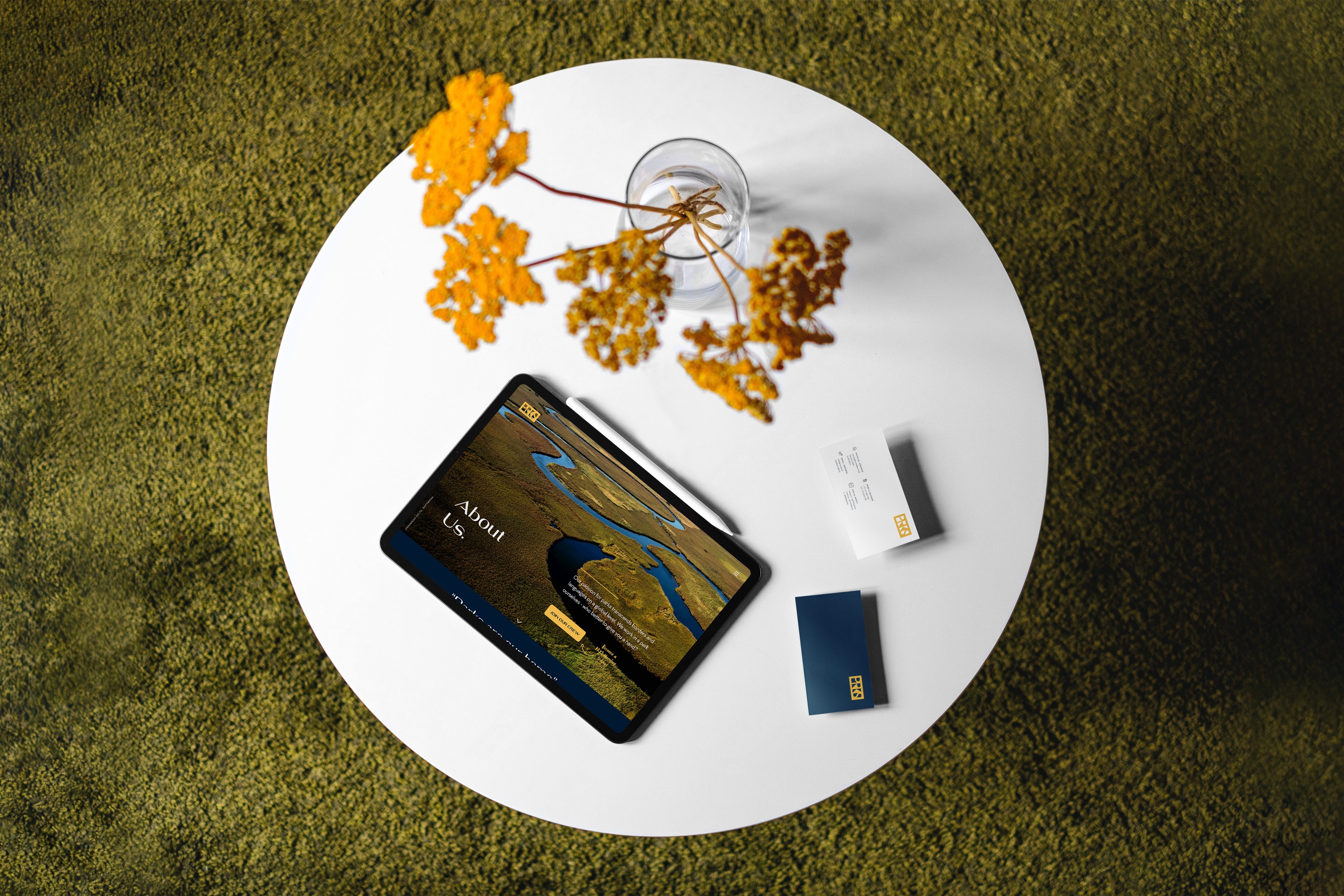
From stationery designs to a website design that extended this earthy, organic aesthetic - PRKS has truly become a seamless extension of the parks it so lovingly celebrates. It was an inspiring project that brought the outdoors into our digital screens with boldness and authenticity.
Next Project
Brand Guidelines
Website Design
PRKS
Project Deliverables Logo Design Brand Identity Design Stationery Design Website Design
For PRKS, the founder’s goal was clear: to celebrate and reflect the natural beauty of national parks through the brand across the globe - from coast to mountain-top. I worked closely with him to create a logo and brand identity that mirrored the natural landscapes he cherished.
The logo design cleverly mimics the shapes of park themselves, sometimes straight and sometimes curvy - integrating them directly into the letters “PRKS.” To enhance the brand’s connection to nature, I developed a colour palette of natural sandy and clay tones, which became the foundation of the brand’s confident visual identity.
From stationery designs to a website design that extended this earthy, organic aesthetic - PRKS has truly become a seamless extension of the parks it so lovingly celebrates. It was an inspiring project that brought the outdoors into our digital screens with boldness and authenticity.