
Brand Guidelines
The W8 Room
Project Deliverables Logo Design Brand Identity Design Brand Guidelines


The W8 Room is all about capturing the beauty of making the most of waiting on God’s time.
The founder wanted a design that resonated deeply with women navigating patience and faith in their journeys, and making that time count.
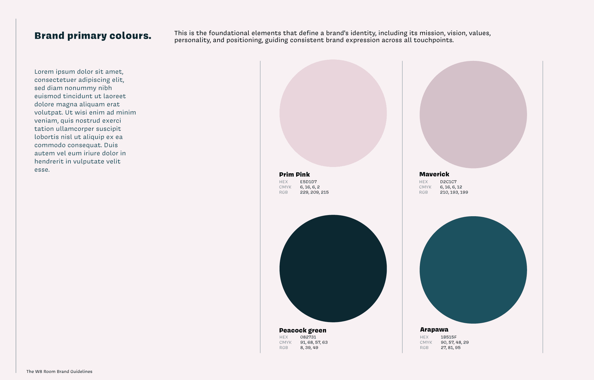
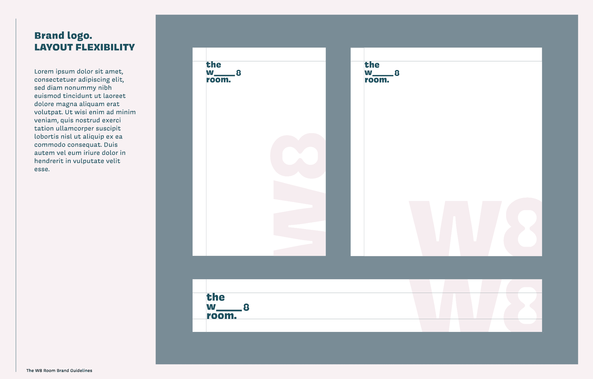
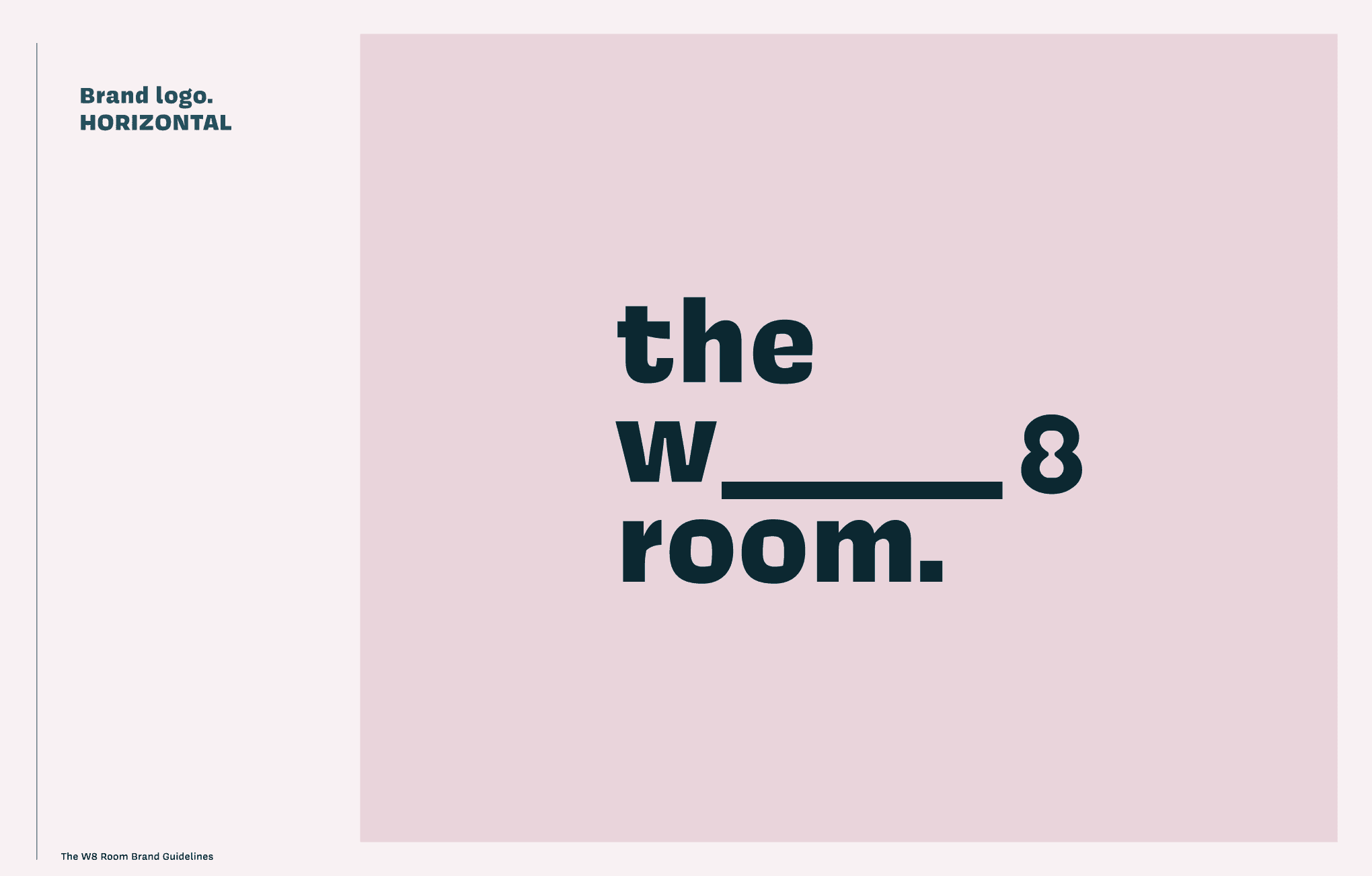
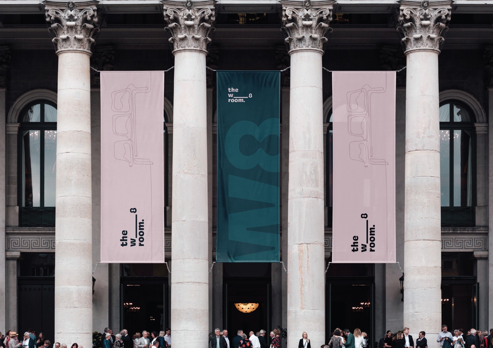
I designed a logo and brand identity with an elegant hourglass subtly integrated into the number 8, symbolising time and grace, with a subtle dumbbell shape signifying the power and strength of faith. A colour palette of bold pinks and teal tones added warmth and strength - creating a brand identity that’s both striking and meaningful.
This project was all about storytelling through design, and I’m proud of how the visuals perfectly echo the founder’s message and inspire women everywhere.
Next Project
Brand Naming

Brand Guidelines
The W8 Room
Project Deliverables Logo Design Brand Identity Design Brand Guidelines
The W8 Room is all about capturing the beauty of making the most of waiting on God’s time.
The founder wanted a design that resonated deeply with women navigating patience and faith in their journeys, and making that time count.
I designed a logo and brand identity with an elegant hourglass subtly integrated into the number 8, symbolising time and grace, with a subtle dumbbell shape signifying the power and strength of faith. A colour palette of bold pinks and teal tones added warmth and strength - creating a brand identity that’s both striking and meaningful.
This project was all about storytelling through design, and I’m proud of how the visuals perfectly echo the founder’s message and inspire women everywhere.